The wedding industry is one of the most visually driven sectors there is. Couples are planning the most important day of their lives, and they’re spending a significant amount of time researching online before they make a single enquiry. Your website is doing a lot of work before you ever pick up the phone.
The problem is that many wedding businesses — planners, stylists, florists, photographers, caterers — have websites that don’t reflect the quality of their work. Beautiful portfolios are buried behind slow-loading pages. Enquiry forms are hard to find. The messaging is generic. Couples move on.
Here are the five things that consistently make the difference.
1. A clear message above the fold
The first thing someone should see on your homepage is what you do, who you do it for, and roughly where you’re based. Not a tagline. Not a mission statement. Something concrete: “Rustic wedding styling across the Midlands and beyond.”
Most wedding websites open with a large image and a vague headline like “Creating Memories” or “Love is in the Details.” These say nothing useful. A visitor who doesn’t immediately understand what you offer will leave — and with the volume of choice couples have, they won’t come back.
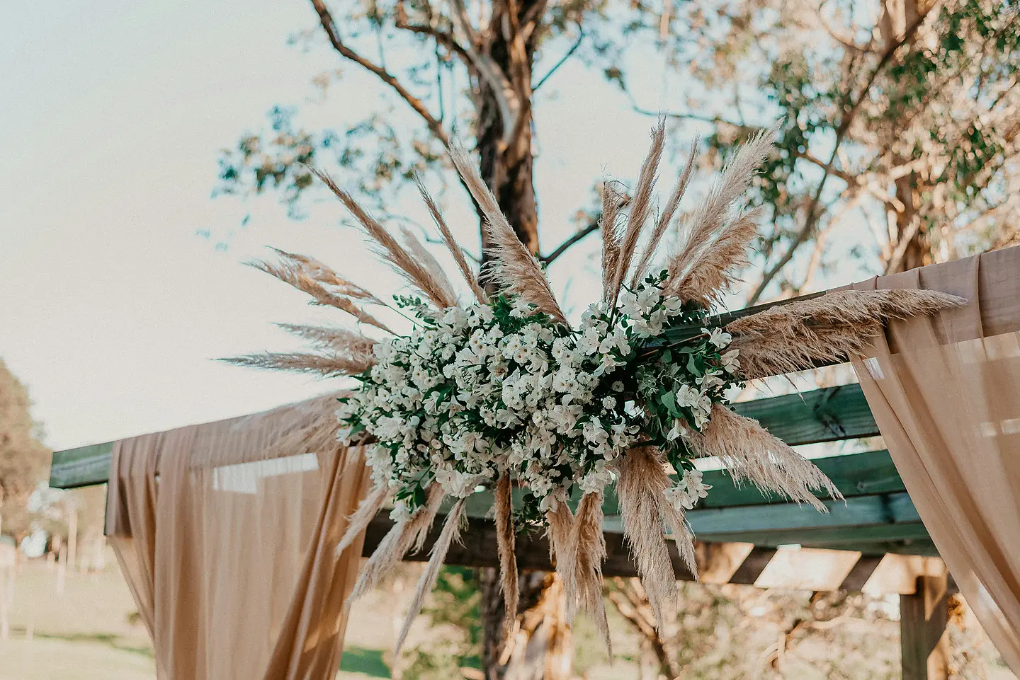
2. Real imagery of your actual work
Stock photography kills credibility in the wedding industry. Couples can spot it instantly, and it signals that you either don’t have strong work to show or you’re not proud of it. Real images from real events — even if they’re from just one or two bookings — are infinitely more effective.
If you’re just starting out, consider doing a styled shoot. Collaborate with a local photographer and a venue. Build a small portfolio of images that genuinely represent your aesthetic. It’s a modest investment that pays for itself with the first booking it generates.
3. A simple, friction-free enquiry process
The path from “I like this” to “I’ve submitted an enquiry” should take no more than three clicks and two minutes. A short form asking for a name, email, wedding date, and a few lines about what they’re looking for is all you need.
Long forms with ten required fields, mandatory phone numbers, and CAPTCHA puzzles introduce friction that makes people give up. The goal is to lower the barrier to first contact, not to qualify leads before you’ve even spoken to them.
4. Trust signals that do the convincing for you
Testimonials are the single most persuasive element on a wedding business website. Couples are trusting you with an irreplaceable day. Social proof — real quotes from real couples, with names and preferably photos — reduces the perceived risk of enquiring.
Feature your best reviews prominently. If you have a Google Business profile with five-star reviews, link to it. If you’ve been featured in any publications or directories, mention it. These signals compound: each one makes the next person slightly more likely to get in touch.
5. A mobile-first design
The majority of wedding research happens on phones. Couples are browsing during commutes, in the evening on the sofa, and sharing links with each other throughout the planning process. If your website is difficult to navigate on mobile — small text, overlapping elements, slow loading images — you’re losing enquiries every day.
A mobile-first design doesn’t mean a stripped-back experience. It means designing for the small screen first, where the constraints force you to prioritise what’s actually important. The result is a website that works beautifully everywhere.
Common mistakes to avoid
Too cluttered. More content does not mean more enquiries. A focused, edited website outperforms a busy one every time.
No clear call to action. Every page should have one obvious next step. Usually that’s “get in touch” or “check availability.”
Slow loading. Wedding imagery is beautiful but heavy. Unoptimised images kill page speed and search rankings. This needs to be addressed at the build stage, not as an afterthought.
In the wedding industry and your site isn’t bringing enquiries?
I’d be glad to take a look and tell you what’s working and what isn’t. No pressure, no commitment — just an honest conversation.
Get a Free ReviewPaul Gregory
Web designer based in Lichfield, West Midlands. Get in touch.